Home Care and Caregiver Websites: Helping Worried Families Feel Safe Enough to Call
The person reading is usually a worried son or daughter. Here is what a care website needs to show them, with a real redesign.
The person reading a home care website is usually not the patient.
It is a son or daughter. Their father just came home from hospital, or their mother can't be left alone anymore, and they are trying to sort it out between work and everything else. Many are reading late at night, on the phone, already tired.
They are not comparing fonts. They are asking a very personal question: can I trust these people inside my parent's home?
That is why a care website needs a different feeling from most business websites. Calm, clear and honest beats clever and loud.
What a worried family needs to know
When I plan a caregiver or home care website, I think about the questions in the order a family usually has them:
- Can you help with this?
- Who will come?
- Do you cover my area?
- How does it work?
- Talk to someone
Explain the services in normal words
Families are often not sure what they need. Is it a caregiver for bathing, meals and company? Or a nurse for wound dressing or tube feeding? Explain the difference simply, and say which one you provide. If you are not a nursing provider, don't let the wording suggest you are.
Show who will come to the house
This is the biggest fear. Explain how you choose and prepare your caregivers, but only what you really do: interviews, background checks, training, supervision. If caregivers speak Mandarin, Cantonese, Malay or Tamil, say so. For an elderly parent, being understood is part of the care.
Areas and arrangements
List the areas you cover, and the types of arrangement you offer: a few hours, day shifts, overnight, live-in. If you can, explain how pricing works, even if the final price comes after an assessment. "We'll quote you" feels like a trap to a stressed family. "Price depends on hours and care needs. Here is how we work it out" feels honest.
What happens after they contact you
Spell it out. Send a WhatsApp, we call you back, we do an assessment, then we arrange the caregiver. A family that knows the next three steps is much more likely to take the first one.
A care website I redesigned: Sands Caring
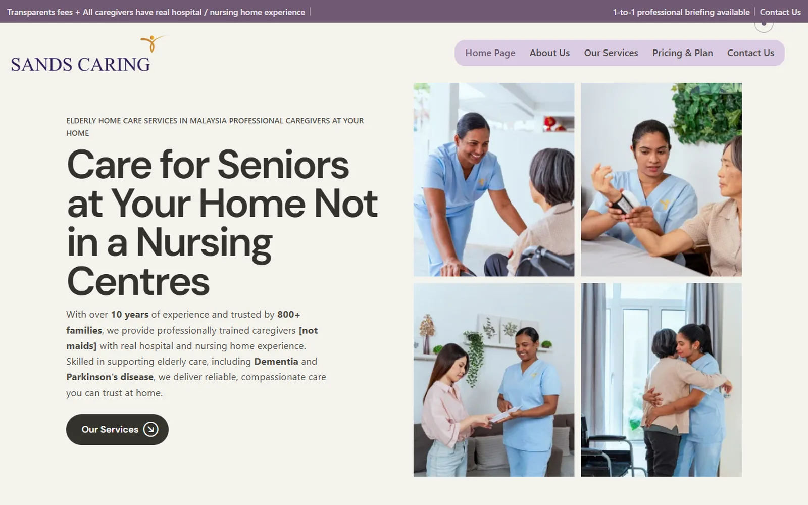
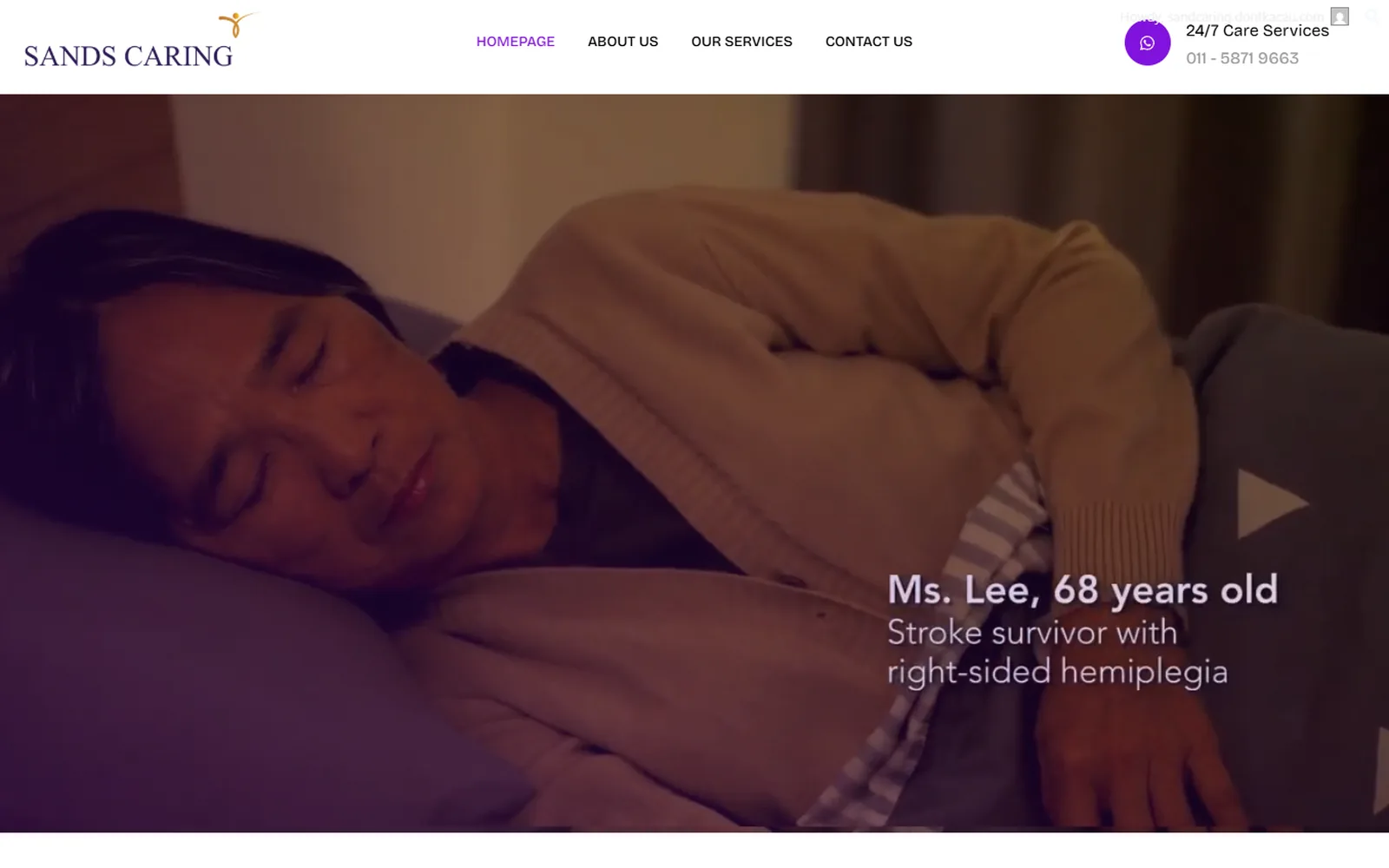
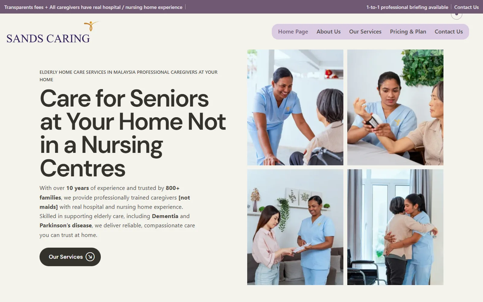
Sands Caring provides home caregiver services. Here is the first screen of their website before and after.
What happened
- The situation
- Their previous website relied heavily on AI-written content and a template from an agency, but the final cost was surprisingly high. The page felt crowded and did not match the calm nature of their service.
- What I changed
- A cleaner, softer and easier website, with stronger proof and less clutter, so visitors can browse with a calmer feeling before making contact.
- The lesson
- For care services, the feeling of the website is part of the message. A busy page full of generic AI paragraphs makes a family more anxious, not less. Fewer words, real proof and a gentle next step work better.
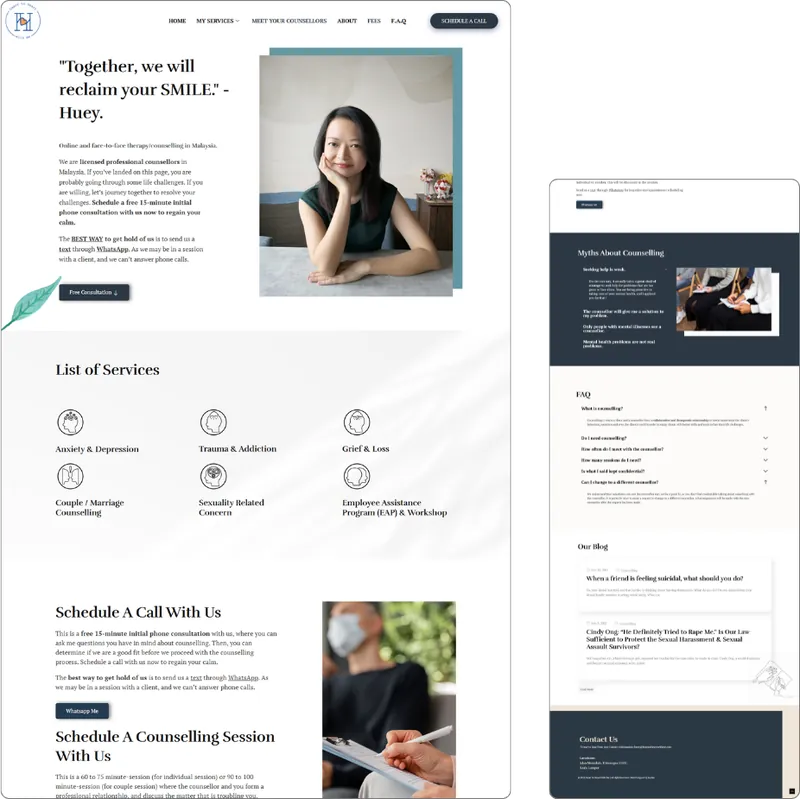
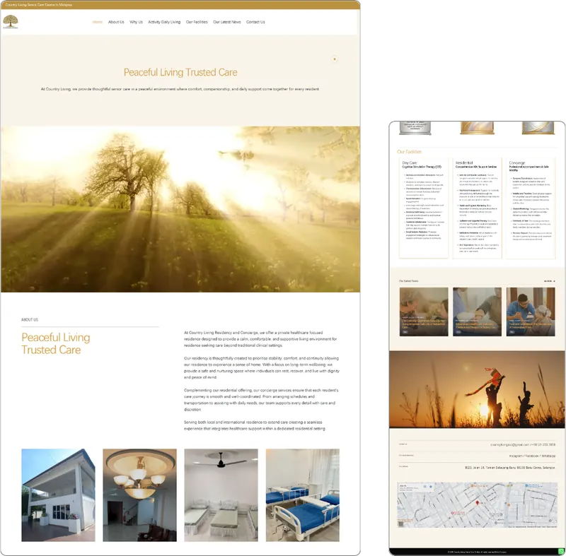
More health and care websites from my portfolio.
Running a clinic instead?
Clinics have extra rules. The Ministry of Health says private hospitals, private clinics, private radiology clinics and private medical laboratories must get prior approval from the Medicine Advertisement Board (MAB) before advertising medicines or health services (MOH Pharmacy Services). MAB also has policies on what such ads may show, for example on before-and-after pictures. Check the current MAB guidelines before you publish treatment pages or run ads.
Where Google Ads fits
Care searches are often urgent and local: "caregiver for elderly Puchong", "home care after stroke KL", "part time caregiver PJ". These are worth paying for if you can really serve that area.
- Limit ads to the areas your caregivers can reach (location targeting).
- Exclude job seekers. Searches like "caregiver job", "caregiver salary" and "caregiver course" are common in this industry, and they will eat your budget (negative keywords).
- Send people to a page about that exact service, with a WhatsApp button that is easy to tap.
- Never promise recovery or results in ads. Keep the message about what you do and how you do it.
Mistakes I see on care websites
- Long paragraphs that sound written for search engines, not for families.
- Stock photos of foreign nurses that look nothing like your team.
- No areas listed, so a family in Klang doesn't know if you go there.
- No explanation of the difference between a caregiver and a nurse.
- A form asking for full medical history before the family has even spoken to you.
A family is not buying a service. They are trusting you with someone they love.
Where I would start
I would start with real photos of your team (with permission), a clear explanation of each service, the areas you cover and a simple "what happens next". Then I would remove everything that makes the page feel busy.
If you are not sure whether your website needs small fixes or a proper rebuild, these 10 signs can help you decide. And if visitors come but nobody calls, read what I check first when a website gets no enquiries.
References
Running a care service?
Send me your website. I’ll tell you honestly what might be making families hesitate.
Ask LucianWhat I can help with
- Business Website Design
- Website Redesign / Revamp
- Custom Software & Web Applications
- Google Ads Management
- AI Consulting & AI Solutions
- Domain & Web Hosting
No hard sell. If you need help, just ask.

Written by
Lucian Yong
Freelance web designer and digital business specialist in Malaysia with experience designing 582 websites across different industries.