What Office Colour Makes a Business Look More Professional?
There is no magic office colour that guarantees success. Colour should support your brand, the size of the room and how people use the space.
There is no magic office colour that guarantees success. Colour should support your brand, the size of the room and how people use the space.
Neutral colours are easier to live with
White, warm grey and soft neutral tones make a safe base.
Then add
- Brand colour
- Wood
- Plants
- Artwork
Dark colours need space and light
Black, navy and dark green can look premium, but too much can make a small room feel heavy.
Use carefully
- Feature wall
- Meeting room
- Reception detail
- Cabinetry
Do not paint the whole office from the logo
A bright logo colour may look great in small amounts and terrible on four walls.
Better approach
- Neutral base
- Controlled accent
- Consistent materials
My view
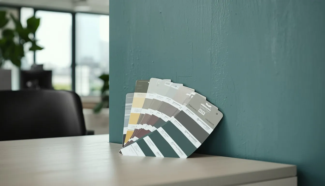
Bring actual paint samples into the office before deciding. Screens and catalogues can fool you.
Need a second opinion?
Have another business question you want me to write about? Send it to me. If it is useful to other business owners too, I may cover it in the Education Blog.
Message LucianWhat I can help with
- Business Website Design
- Website Redesign / Revamp
- Custom Software & Web Applications
- Google Ads Management
- AI Consulting & AI Solutions
- Domain & Web Hosting
No hard sell. If you need help, just ask.

Written by
Lucian Yong
Business owner and freelance web designer in Puchong. I write simple, practical things for Malaysian business owners.
More about me